If you haven’t seen the writing on the wall yet, the world is mobile and your website needs to be mobile too. I know what you’re thinking, you’re in the construction industry and mobile is for B-to-C (Business-to-Consumer) companies. You’re correct in thinking that B-to-C companies need a mobile strategy, especially if they sell online. So do B-to-B (Business-to-Business) companies, even construction. You can not track or even begin to wrap your hands around how many prospective clients, bids, and employees you’ve lost because they can not view your website on a mobile device. I’ve talked to people who’ve missed meetings because they have trouble finding a company’s office and can not find a phone number on the company’s website.
Forbes reported in December 2012 that 13% of all web traffic worldwide is from a mobile device. They added that nearly one-third of American adults own a tablet or e-reader.
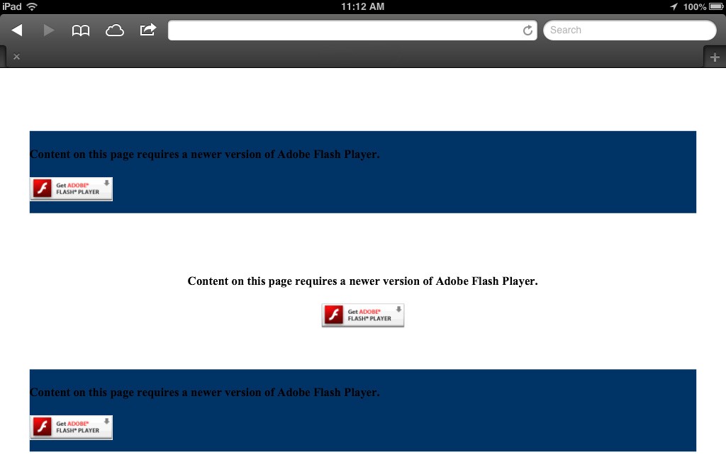
Another huge hinderance to mobile is the use of Flash. Recently, I completed a review of over 400 of the top construction company’s websites and was appalled at how many construction companies still used Flash on their website. This told me either the websites haven’t been updated in over 5-7 years or many of them have been dooped by web companies using fancy graphics and animations. If you don’t know already, Flash and Apple’s iPhone and iPad do not play well together – it was a very public, heated debate. If your company uses Flash on your website, your visitors see a grey box with a question mark or an error message like the website below. (I did remove the company’s name & website address to protect them.)
 You need to take mobile into consideration with your website whether it be a simple one-page website that provides visitors your company name, services, and contact information. From there, give visitors the opportunity to view your entire website. They will have to do the awkward pinch & squeeze to see your website, but you’ve provided them with the vital info and then allowed them to dig deeper.
Ideally, your website is built using the new principle called “Responsive Design”, where your website responds to the visitor’s screen size like the example below.

Whether your visitors are on a desktop, laptop, tablet or smartphone, the website looks great with no need to pinch and squeeze to read a website on your smartphone. A great feature for marketers about Responsive Design is that it utilizes the same website for all three screens, pulling the information from the same CMS (Content Management System) database.
Learn more about Responsive Design in a past blog post.
