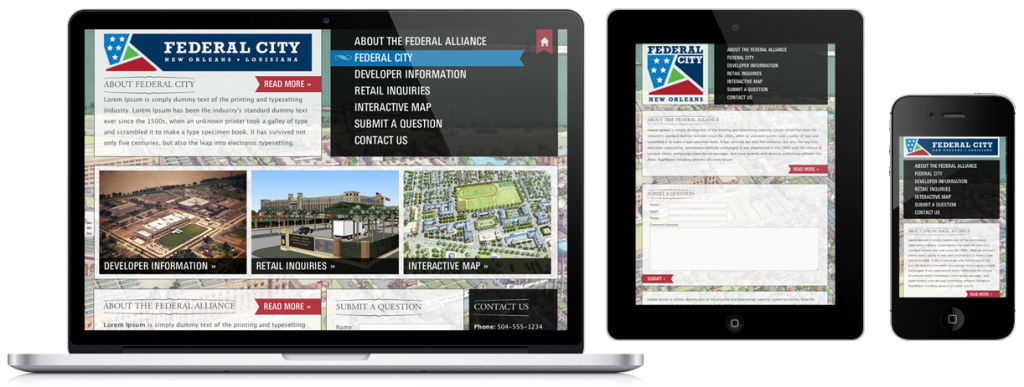
The future is mobile, it is not just for B-2-C companies to worry about anymore. We’ve seen numerous increases in our clients and our own websites’ statistics of users utilizing smartphones & tablets. We’ve also seen spikes from airports because many executives are using their downtime to do research about your market, which includes you and your competitors. Make it easy for them to pick your company.
We have been utilizing a newer web technology called Responsive Design that responds to your visitors screen sizes and adjusts properly. Whether your visitors are on a desktop, laptop, tablet or smartphone, they will see a website geared for them. Look at the above sample for a client of our parent company, Design the Planet, and you will see the same overall look, but the information is reduced based on the user’s device. A cool feature is the tablet, like an iPad or Droid, will actually show different views depending on if it is in landscape or portrait modes – the landscape mode will show the desktop view. No more need to pinch & squeeze your screen to zoom in trying to read a website on your iPhone.
Think about why people access your website from a mobile device. They may just want your phone number, they may want to read about your company or see your projects. Pairing down the information makes it easier for them to find the information they are looking for and it loads faster because you’re showing them less data.
A great feature for marketers about Responsive Design is that it utilizes the same website for all three screens, pulling the information from the same CMS (Content Management System) database. Many company’s have created separate mobile websites over the years, but they have a separate database meaning you have two things to maintain.
Another problem with some mobile websites is that they have a strict size and are not fluid. When the new iPhone 5 came our this year with a taller screen, many mobile websites have a gap in their designs while a Responsive Design is fluid and fills the entire screen. This method is as future proof as we’ve ever seen, even when Apple shrinks things down with the iPad Mini.
A good new year’s resolution for your website, look into Responsive design.
